New Website Design: WP WebHost 2.0
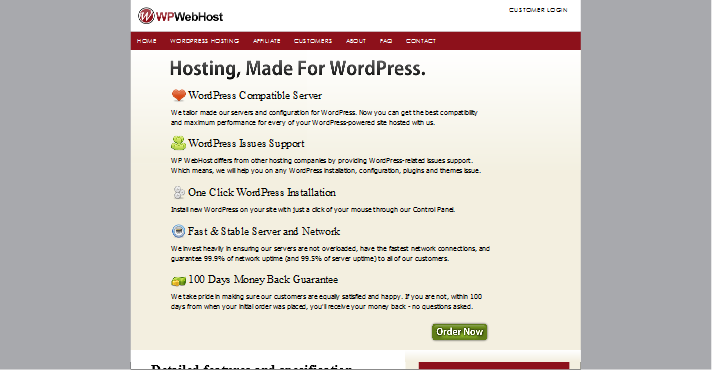
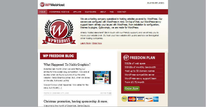
We have upgraded our website (made it before 2009, yay!) to a new interface and design. Instead of the previous sales-letter style of presentation, we are now going for a more traditional approach of web design.

WP Freedom Blog + WP WebHost = WP WebHost 2.0
You might be wondering where did our blog go? Well, we’ve integrated it under our main page. Now you can directly see the blog updates through our homepage.

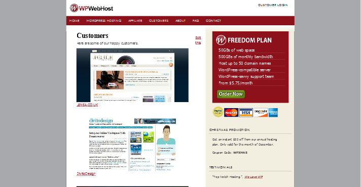
New Section: Customer Listing
We are proud of the customers we host. So, we handpicked a few customers and made a page specially about them. If you host with us and wanted to get yourself listed there, just ask.

“Best of WordPress” Blogroll
If you look at the bottom of our sidebar, you’ll notice a blogroll titled “Best of WordPress”. Yes, we’ve listed every single WordPress ninjas, masters, gurus, sifus and rockstars there. It only shows five at a time, and rotate randomly.
Affiliate Program quietly sneaks in
Surprisingly, even before we announce it, there are already a few of our customers signed up as affiliates (they act so fast that they deserved a prize!). But, we’ll save it for the next post on our affiliate program. If you can’t wait, head over there and sign up first.
What do you think of our new design?
Like it? Hate it? Tell us what do you think. 🙂


I love this one than the old one .. so cool and simpel…
Totally agree with Zalukhu. The design now looks great.
That’s right. WPWebHost as a wordpress blog hosting should bring the blog forward to show to the public 🙂
Yah much more attractive than before=)im sure 2009 will be a good year fo wpwebhost=)
Can see realimprovement on the new one. Keep up the good job.
thinkhost
…the theme looks nice
Nice theme..
Best price..
I love this one than the old one .. so cool and simpel…
I love this one than the old one .. so cool and simpel…
Can see realimprovement on the new one. Keep up the good job.
You seem very knowledgeable.
Starting new to twitter can be intimidating but when you genuinely utilize it as the compelling marketing tool it can be it will pay off in the long run. I believe twitter is a fantastic way to drive traffic to your site.
The article is quite insightful when I found it with search engines on Tuesday by my search for russian lady. I have your blog now in my book marks and I will stop by your blog again, soon. Take care.