
Is Your WordPress Website in Accord with 2019 Design Standards?
We are already approaching the end of the first quarter of 2019. To keep your WordPress website in the vanguard of the web design revolution, you need to understand what’s hot and what’s not in the WordPress platoon.
Design standards evolve fast, and what prevailed just a couple of years back may not triumph today. Fortunately, though, all the principal web design best practices of 2018 are still very much applicable this year as well.
So, without further ado, let’s take a look at what’s making waves in 2019 when it comes to web design and how your WordPress website can stay ahead of the curve.
Mobile First
According to Statista, 52.4% of all website traffic came from mobile devices in Q3 2018. Over the course of 2019, this percentage is expected to rise to over 60%. Also, apart from mobile, there is an increasing percentage of overall traffic coming from tablets, wearables, and even TVs.
It cannot be overemphasized then that your website absolutely needs to be responsive and mobile-friendly in order to deliver the best possible browsing experience to your mobile users.
 Moreover, it’s almost been a year since Google first rolled out mobile-first indexing, which focuses on indexing and ranking of websites by taking into account the mobile version of the web pages rather than the desktop version, as was the case earlier.
So, prioritizing mobile over desktop will also boost your SEO efforts.
Furthermore, due to Google’s Speed Update announced in July 2018, you must also strive to reduce your website’s page load time if you wish to improve your search rankings on mobile, not to mention provide a more satisfying user experience.
Talking about mobile page load time, enter Accelerated Mobile Pages (AMP), which is now considered as a ranking factor by Google. Learn how to easily set up AMP for your WordPress website here.
Minimalism
Slowly turning into a classic, all-time favorite approach to design, minimalism is here to stay in 2019 and beyond. The concept is reminiscent of the “less is more” principle and synonymous with simplicity: the simpler, the better.
Minimalism emphasizes on designing a clean and intuitive interface with as few elements as possible. This would facilitate content consumption and kill redundancy.
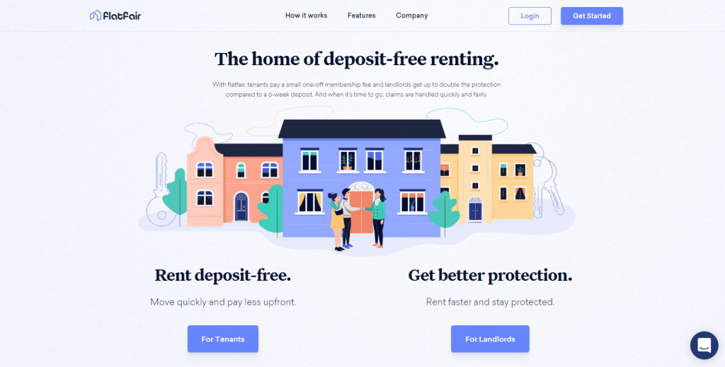
One such minimalist design approach is that of flat design. It features the use of clean and open space, bright contrasting colors, clear typography, and simple two-dimensional illustrations (in place of bulky images) which help in reducing data consumption and in turn, improve page load speed.
Thus, minimalism goes hand-in-hand with Google’s latest algorithm updates and indirectly bolsters your SEO.
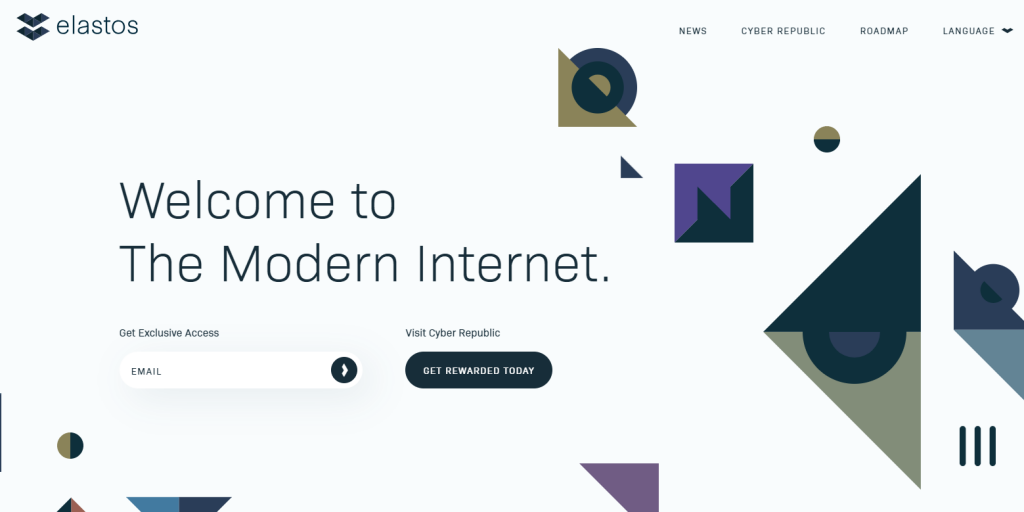 Limiting the clutter and superfluous ornamental bits of the design helps users to focus on the important stuff and makes site navigation easier. Ultimately, all this adds up to increased conversions.
Themes to try when embracing minimalism for your WordPress website:
Animations
Animations are becoming increasingly mainstream in 2019. And for good reason.
Yes, videos are great for audience engagement and storytelling, but they are data-heavy and slow down your website. On the other hand, animations made with plain CSS and JavaScript are lightweight and can deliver the same payoffs without slacking your website.
Purposeful animation is aimed at leveraging motion design to enhance the usability and desirability of the website, producing a pleasant user experience. Furthermore, Torquemag suggests most websites are switching to particle animations because of how extremely lightweight they are compared to videos, as mentioned earlier.
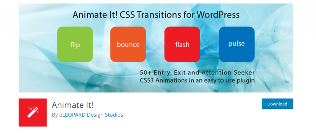
Use plugins like Animate It! to add animations to virtually any type of content, including images and text. You can also decide when the animation will trigger, the number of times it will recur, and set both a start and exit point.
Microinteractions
Have you ‘reacted’ to a post on Facebook recently? Or gave a few ‘claps’ for an article on Medium? Sure you have. And that means you’ve experienced microinteractions first-hand.
 Microinteractions are tiny ‘tasks’ for users to perform while consuming content which increases meaningful user engagement. They are the life of social media platforms but are quickly making their way to media and entertainment websites (BuzzFeed, HuffPost, etc.).
They supply a sense of tangibility to your website. The users would feel as if they are really interacting with your content, rather than merely staring at a static slab of information.
For example, you can use plugins like Better Click to Tweet to facilitate more Twitter shares of the most important bits of your content.
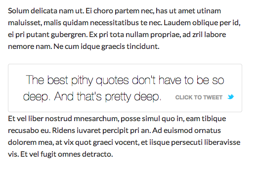 You can also use the Highlight and Share plugin to replicate HuffPost’s strategy.
 Page Builders
Although not classified as design standards, page builders are worth a mention. In essence, page builders (plugins) allow you to design intricate looking WordPress websites without having to code a single line. Gone are the days when you had to learn how to code in order to build a good-looking, functioning website.
For WordPress users, page building plugins like Elementor and WP Beaver Builder have democratized web design by eliminating back-end work and allowing real-time front-end design. This means you can swiftly build unique and attractive websites, page-by-page, by simple drag-and-drop.
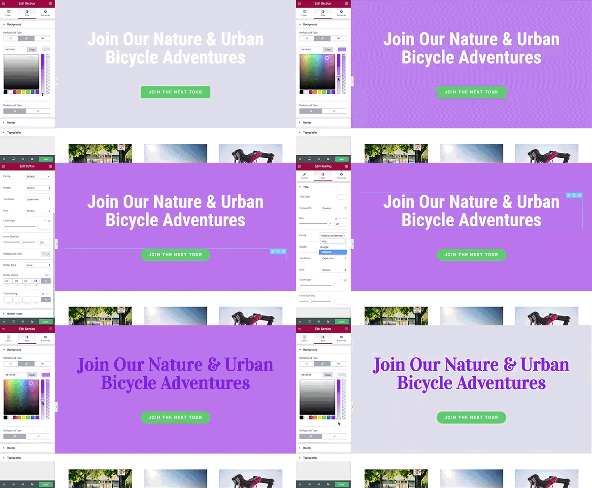 While many are still skeptical about their effectiveness and prefer the old school way of building websites from the ground up, it is quite indisputable that website and page builders are the way of the future.
Over to You
These five items are certain to play a big role in the field of web design in 2019. What other design elements do you think deserve more attention? Let us know in the comments below!


